Good stories are a lot like documenting user experience designs. A good story will track a journey from the background/origin, through to a point of inflection, and eventually a resolution. Good user experience design documentation should do the same thing.
Process is an important part of user experience design and as a result it’s also an important part of showcasing a UX project. The value a user experience designer brings to a business or project is the ability to solve-problems in a systematic and reproducible way; it is this process we need to show. It simply isn’t enough to write a background to a project and include UI mock-ups of the final product; what’s important is the thinking that got you there, not the final result.
Documenting the UX Process (a.k.a Case Studies)
Any user experience documentation should ultimately reflect the user experience design process it is showcasing. The “double-diamond design process” is a popular UX framework and as such can be also used as the basis for our UX documentation/presentation.
User Experience Presentation/Case Study Scaffold
- Project Overview
- Project Name
- Tagline
- [Hero Image]
- Table of Contents (if long document)
- Problem Statement
- Challenge
- Goal
- Process/Methodology used
- Role and responsibilities – Your Role and responsibilities (UX designer, researcher, project manager, Self-Directed Project)
- Duration
- Tools Used
- Discover/Understand
- User Research
- User Interviews
- Questionnaire
- Affinity Mapping
- Empathy Map
- User Journey Maps
- Audit of existing products
- Competition Analysis
- User Persona
- User Research
- Define/Ideate Solutions
- User Flows
- Wire-framing Sketches
- Prototyping
- Develop/Testing
- Usability Testing
- Survey
- Statement of findings & how they shaped the design
- Usability Testing
- Deliver/Implement
- Information Architecture
- Accessibility
- Files for Client: Design Systems/Guidelines & Design Assets
- Final Design (High fidelity)/Mockups
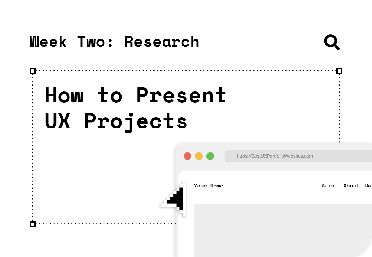
Notable Portfolio Site Designs
A design portfolio website doesn’t need to have all the bells & whistles you see on some people’s sites. Just because you’re a UX/UI designer doesn’t mean you have to employ every trick in the book, sometimes Less is More. The following are a collection of simple portfolios that are easy to navigate and understand:
- https://www.carsonyoung.ca/
- https://www.jingqiao.design/
- http://karoliskosas.com/
- https://www.tparkes.com/
- https://www.patcapulong.com/
- https://uxfol.io/maxberger
Notable UX Case Studies & Project Presentations
- https://www.nicolaspellegrino.com/ponder
- https://joshglucas.com/project/mimic
- https://www.patcapulong.com/work/onedaijo
- https://www.cristianodalbem.com/ciclomapa/
- https://uxplanet.org/case-study-watering-tracker-ui-design-for-home-needs-5cab88fd89db
- https://medium.com/@helloilijav/productivity-tracker-app-small-ui-ux-case-study-3a8031479b5f
Final Thoughts
As I was researching this UX presentation scaffold and looking for good examples of designer portfolios I developed a headache. There seems to be some serious irony around user experience designers not creating a very good experience around how their work is presented. When looking at a large number of project across multiple portfolios (as an employer would), its often difficult to to gauge a high level the process/methodology and how text and images are laid out can be somewhat disorientating (even on some of the ‘best’ portfolios). For this reason, I think it would be beneficial to include a ‘table of contents’ at the beginning, include a quick overview of UX methodology employed, and try to present work in more of a ‘Behance’ layout when text is often complemented by visual materials, enhancing whats being expressed instead of segmenting it.